Plotting data using Jupyter Notebooks
In this tutorial, we will go through the steps necessary to create a Jupyter Notebook, and use it to plot data fetched using the Tracking History API.
Source code#
You can find the source code of the following tutorial here.
If you wish to see the final result of the tutorial, please head here.
Jupyter Notebook installation#
Using Python#
Let start by creating a new Jupyter Notebook. Here assume that you have Python installed on your machine. Let's start with upgrading pip:
And then:
Using Anaconda#
info
For less experienced users, using Anaconda will be a simpler solution.
Anaconda will install both Python and Jupyter Notebook all at once. To install Anaconda, simply head here and download the program for your OS.
Creating your Notebook#
Running Jupyter Notebook#
Now that everything is installed, you can now simply run:
Your browser will open up with the Jupyter Notebook interface, that looks like this:

info
You should run that command in a folder where you wish your Notebooks to be created.
Now that your Jupyter interface is up and running you can simply create a new Notebook by clicking New and then Python 3. You are now ready!
Fetching data#
First, we need to install a few dependencies for our Notebook to work properly. We will start by installing requests, the package that will allow us to query the Tracking History API.
In our Notebook, we can add a new Cell and add the following:
Here, we are simply calling the API with the query parameters to get data around Shanghai (SHA), and printing the response we received.
If everything is set up correctly, you should see <Response [200]> appear as a result after running your Notebook.
Introduction to Pandas#
Pandas is a very useful Python data manipulation library that will save us some time when filtering, organizing and plotting our data after fetching it from the API.
Let's install it so we can use it in our Notebook.
- Python
- Anaconda
Now, we can update our Cell and parse the response from the query, and create a new Panda Dataframe with the results:
Introduction to Plotly#
For this example, we are gonna use Plotly to plot the retrieved data points. However, you could also make this work with a number of other libraries, such as Matplotlib for example.
- Python
- Anaconda
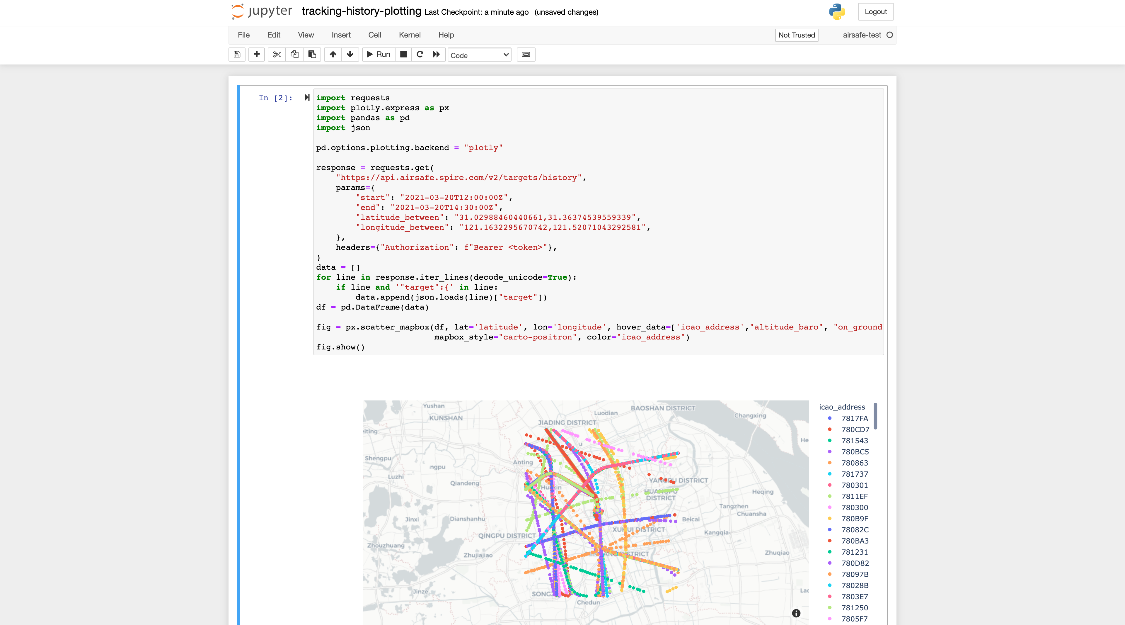
Now, we can update our Cell to plot our results on a map! Let's go over the changes:
Here is a breakdown of the modifications we did here:
- We modified the default plotting library by modifying the default Plotly configuration.
- We created a Mapbox instance and filled in the parameters by defining the latitude and longitude fields name, as well as some other details such as the data appearing when hovering on a point.
- We display that instance
It should now look something like that: